HOlland america hq
How can an office space become a tactile, immersive BRAND experience?
The new headquarters building for Holland America Cruise Lines in Seattle, WA is more than just the company's main office and operations center. The space is an on-land interpretation of the experience of a cruise ship that brings delight to everyday tasks for both employees and visitors alike.
SETTING
SkB Architects
ROLE
associate designer
TOOLS
revit
sketchup
photoshop
indesign
illustrator
DELIVERABLES
strategy and concept design
design development
construction documents
presentation drawings
BACKGROUND
As part of the design team I was involved in research and visioning, schematic design, design development, and construction documentation. I developed graphics for presentations and reports, collaborated on interior and architectural design work, and produced construction documentation drawings.
The Holland America headquarters building is a 5-floor, 140,000 square foot interior architecture and branding project. The challenge for this project was to create a workspace that meets the needs of a large (and evolving) number of employees in a tight square-footage, while also creating an immersive brand experience for employees and visitors alike.
DESIGN
OBJECTIVES
BRANDING
Infuse the space with the spirit of the cruise line in subtle and integrated ways.
COMMUNITY
Provide a variety of work and meeting spaces for employees and guests to experience throughout the day.
FLEXIBILITY AND ADAPTABILITY
Create spaces that will be able to evolve as needs change.
Want to see more?
RESEARCH AND
VISIONING
My team began the project with research into what exactly the new office space needed to be. We received user research from an outside change management company, and also conducted site visits, interviews, and employee focus groups.
Some of the questions we were asking:
- How much space was actually needed?
- What other functions happen, besides offices?
- What are the needs and desires beyond a functional office space?
- What are the department sizes and relationships?
- How many meeting spaces are needed, and what types and sizes?
I summarized our findings in a pre-design report, along with some strategic visioning ideas to get our client thinking about what their space could be:
SCHEMATIC
DIAGRAMS
This series of diagrams shows the conceptual approach to the design. I created these as a summary of our schematic design work to communicate key design concepts to the client and other stakeholders.
Major points include:
- making the central atrium the communal focus of the building
- providing visual and physical connections horizontally and vertically throughout the space
- conceptual reference to the way a ship is laid out, especially in terms of circulation and density
PLAN DIAGRAMS
The circulation and organization of spatial types in the building references a cruise ship:
click to enlarge
SECTION DIAGRAMS
THE ATRIUM
ORIGINAL ATRIUM DESIGN
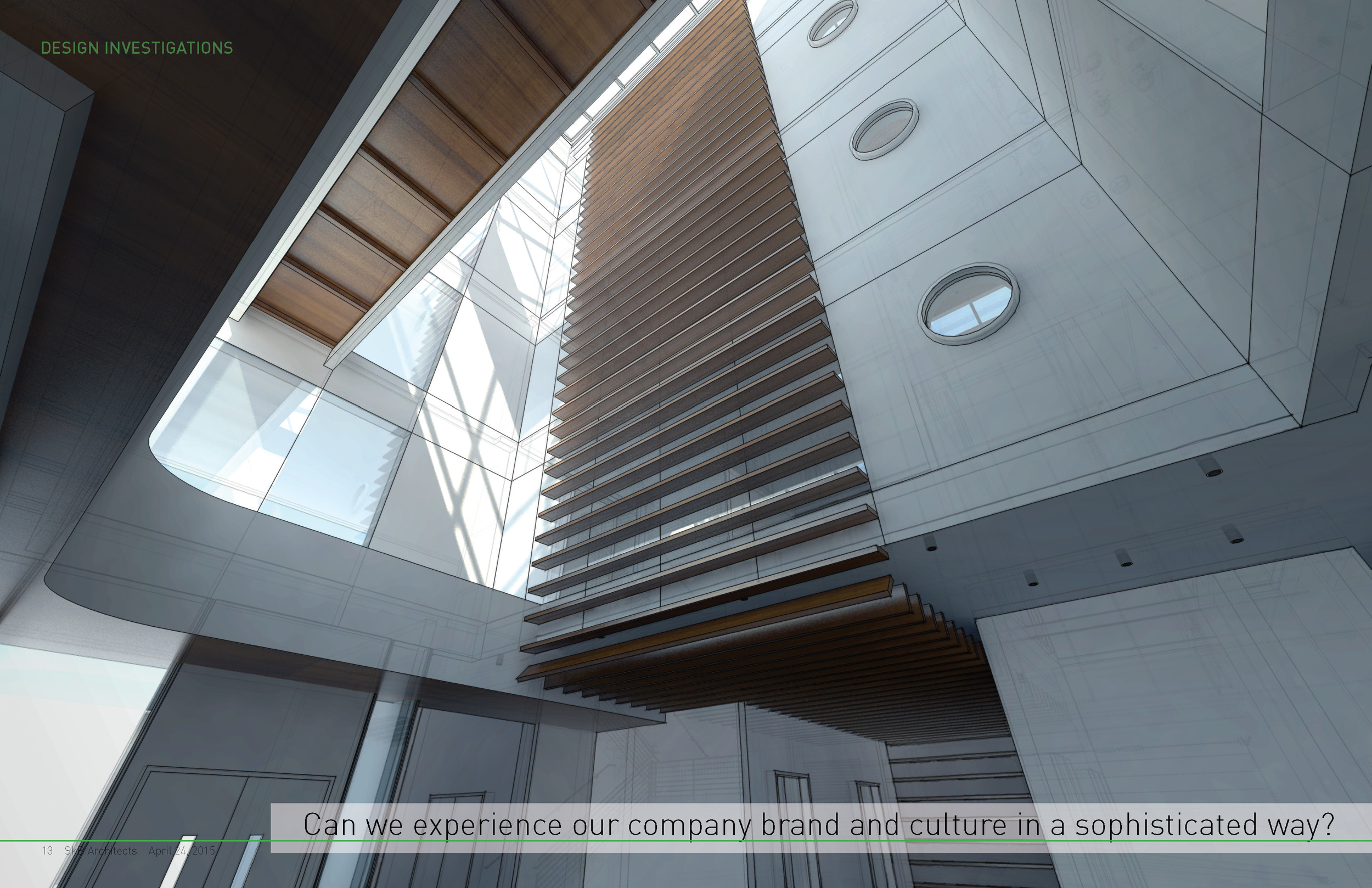
The original atrium was designed for an office building with multiple tenants. However, once it was established that Holland America was going to lease the entire building, there was an opportunity to make the atrium the focal point and use it as a building-wide amenity.
POTENTIAL DESIGN ISSUES AND SOLUTION ALTERNATIVES
DESIGN
The design solution for the atrium opens it up to the upper floors and to the elevator lobbies through port-hole windows (behind the white feature wall).
Early schematic section drawing of the central atrium.
TYPICAL
FLOOR PLATE
Most of the floors have a similar layout, which is illustrated in the floor plan diagrams in the above section. We worked through several diagrams before settling on the final one.
KEY ATTRIBUTES:
- Open office plan - no private offices
- As much access to natural light and views as possible, for everyone
- Branded 'ship-like' feel to the space, without being too cheesy
- Ability for departments to grow, shrink, or adapt workspace as needed
Floor plan diagram
Alternate floor plan diagrm
Schematic floor plan drawing
COMPLETED
PROJECT IMAGES


