Take Claim
HELPING PEOPLE TAKE THE NEXT STEP IN THEIR PROFESSIONAL LIFE.
The experience of filing for unemployment benefits is a stressful and confusing one — the current process is not conducive to today’s mobile lifestyle, nor does it take advantage of readily available technology to share resources and information. Take Claim is a mobile platform for those eligible for unemployment benefits can keep track of their job applications and connections and manage their weekly claims.
SETTING
General Assembly
User Experience Design Immersive
2 week sprint
ROLE
designer
researcher
project manager
TOOLS
hand sketching
sketch app
adobe XD
DELIVERABLES
user research
precedent research
design strategy
interactive prototype
PROJECT PROMPT
We were tasked with developing a mobile website for the Washington State Unemployment Office that would allow residents to file their claims on their mobile device. For this two week sprint, we were asked to focus on the following issues:
- Currently residents can file claims over the telephone or online.
- Approximately half of the claims that could be done online actually are.
- The website has usability issues, and the design recommendations for the mobile site should be applicable to the desktop site as well.
- There have been requests from users for the ability to file a claim and access information about their benefits on their mobile devices.
UX OBJECTIVES
FLEXIBILITY
Allow users to file their weekly unemployment claim on their schedule
CLARITY
Make the process straightforward, and break it down into manageable steps
TONE
Use language that is familiar and conversational, yet professional
READY TO SEE HOW IT WORKS? VIEW THE PROTOTYPE IN ACTION:
CONTEXT AND
RESEARCH
The initial discovery phase of this project was focused on finding out how the process of filing for unemployment actually works and what the scope of our project needed to be. Our research consisted of:
- Survey about the experience of filing
- Usability testing the existing website
- User interviews
- Expert in-situ interviews
usability testing the existing website
HOW DO YOU ACTUALLY FILE FOR UNEMPLOYMENT?
We conducted a series of user interviews to understand how the process of filing for unemployment benefits works. The process is two-fold: an initial claim and a weekly claim. Both processes are currently done either on the website or over the phone, and involve a very specific and lengthy form. The form must be completed all at once, at a specific time of the week. There is no way to save your progress or troubleshoot. There is no physical office or mobile-friendly application.
THE CURRENT WEBSITE
A heuristic evaluation and usability testing revealed some key usability issues on the current website:
SURVEYS AND INTERVIEWS
We sent out a screener survey (12 responses) and followed up with in-person interviews (6). We then used affinity mapping to identify trends and common user pain points.
Who we interviewed:
- People who have experience filing a claim
- Employees at WorkSource, the affiliated career services organization
affinity mapping our interview results
“If I became unemployed, I wouldn’t even bother filing.
Its a mess. ”
“I feel as though I am being tricked into making a mistake”
SYNTHESIS AND
PROJECT SCOPE
KEY FINDINGS FROM RESEARCH PHASE
Feeling of fear and anxiety around the experience of filing for unemployment
Lack of clarity on site and confusing wording on website and required forms
Requirement to keep track of information such as weekly job 'searches' in multiple places
- Lack of flexibility in the weekly filing process
UX VISION
Create a mobile platform that complements the existing website; where someone eligible for unemployment benefits can keep track of their job applications and connections and manage their weekly claims. The user will be supported and assured throughout the process in a way that feels respectful, thoughtful and clear, giving the user confidence their claims have been done correctly and completely.
Ability to keep up on job applications throughout the week
Ability to submit weekly claim via mobile application and streamline the process
Re think the voice and tone of the product
PERSONA AND
SCENARIO
PERSONA
We developed our persona based on our surveys and user interviews.
STORYBOARD SCENARIO
CASE STUDIES
EXISTING MOBILE APPS IN OTHER STATES
- Pared down to a single primary task
- Clear calls to action
- Relevant updates and notices
Turbo Tax
- form heavy product that breaks down the process into manageable steps
- conversational, clear voice and tone
- glossary of terms
- mobile app is a companion to the full website
DESIGN
AND USABILITY
TESTING
USER FLOW - FILING A WEEKLY CLAIM
Our minimum viable product 'MVP' for this project addresses filing a weekly claim. The proposed flow gives the user the ability to file their weekly claim incrementally, tracking progress throughout the week and finally submitting at the end of the week.
VOICE AND TONE
- Supportive, and not condescending
- Empowering without being overbearing
- Friendly but not unprofessional
- Convenient but not casual
The copy is written in short, simple sentences to communicate honesty and truth. It is clear and concise, conversational yet professional. It is motivational, giving users confidence to not only find a job, any job, but also to take this opportunity to ‘level up’.
WIREFRAME DEVELOPMENT
We developed wireframes for our proposed flow, conducting usability tests to help inform the next iteration.
Shown here is the development for the weekly claim filing page, from hand sketching to final wireframes.
WIREFRAMES
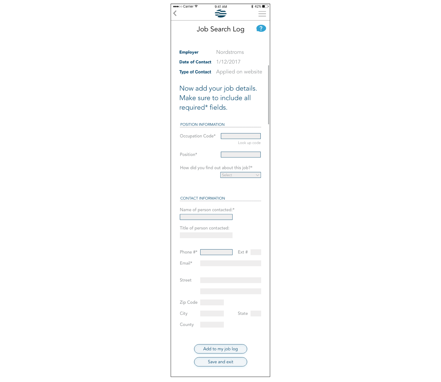
For this two week sprint, we delivered wireframes for the two most important weekly tasks:
- Adding to the job log
- Filing a weekly claim
Key features integrated:
- ability to add to job log throughout the week
- ability to save progress and return later when filing weekly claim
- notifications and reminders
- long forms and processes broken into manageable steps
- glossary of terms and definitions


